
The Bottom View – Details Compare
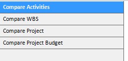
Provides quick access to different comparison perspectives within the Compare Projects functionality. This navigation panel displays a list of available comparison tabs, allowing you to switch between different analytical perspectives of your project versions:
- Compare Activities – View changes to tasks and activities, including additions, deletions, and modifications
- Compare WBS – Analyze changes to the Work Breakdown Structure and project hierarchy
- Compare Project – Review high-level project metrics such as dates, duration, and milestones
- Compare Project Budget – Examine budget differences across various cost categories
Simply click on any comparison option to instantly switch to that view. The currently active comparison is highlighted in blue, making it easy to identify which perspective you’re currently viewing. This streamlined navigation ensures you can efficiently move between different aspects of your project comparison without returning to the main menu, enabling comprehensive analysis of all project changes from a single interface.
Compare Activities
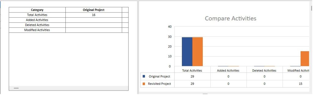
The “Compare Activities” tab provides a summary of activity changes between two project versions, highlighting what has been added, removed, or modified. This view consists of two integrated sections:
Comparison Table (Left) – The table displays activity statistics across two columns: Original Project and Revisited Project. Each row tracks a specific type of activity change:
- Total Activities: The complete count of activities in each project version
- Added Activities: Number of new activities introduced in the Revisited Project (this row is blank for Original Project as it serves as the baseline)
- Deleted Activities: Number of activities removed from the Original Project (this row is blank for Revisited Project)
- Modified Activities: Number of existing activities that have been changed in the Revisited Project (such as duration, dates, resources, or other attributes)
Visual Chart (Right) – The bar chart titled “Compare Activities” provides a clear visual representation of activity changes:
- Side-by-side bars compare values across categories, with blue bars representing the Original Project and orange bars representing the Revisited Project
- Total Activities shows both versions for direct comparison of overall project scope
- Added Activities, Deleted Activities, and Modified Activities display single bars (orange for additions and modifications, blue for deletions) to emphasize the nature of each change
- A data table below the chart provides exact numerical values for each category
- The legend clearly identifies which color represents each project version
This view enables you to quickly assess the extent of project changes, understand whether the scope has expanded or contracted, and identify how many existing activities have been updated between the two versions you’re comparing.
Compare WBS
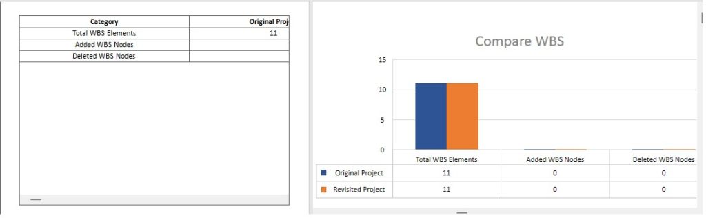
The “Compare WBS” tab displays changes to the Work Breakdown Structure between two project versions, showing how the project’s hierarchical organization has evolved. This view is divided into two coordinated sections:
Comparison Table (Left) – The table presents WBS statistics across two columns: Original Project and a column for the revised version (header appears to be cut off in the image). Each row tracks a specific aspect of WBS structure:
- Total WBS Elements: The complete count of all WBS nodes (work packages, deliverables, and summary tasks) in each project version
- Added WBS Nodes: Number of new WBS elements introduced in the revised project (this row is blank for Original Project as it serves as the baseline)
- Deleted WBS Nodes: Number of WBS elements removed from the Original Project (this row is blank for the revised version)
Visual Chart (Right) – The bar chart titled “Compare WBS” provides a graphical representation of WBS changes:
- Side-by-side bars display values for each category, with blue bars representing the Original Project and orange bars representing the Revisited Project
- Total WBS Elements shows both versions side-by-side to compare the overall project structure size
- Added WBS Nodes and Deleted WBS Nodes display single bars to highlight structural changes
- A data table below the chart shows exact numerical values for each category (Total WBS Elements, Added WBS Nodes and Deleted WBS Nodes)
- The legend clearly distinguishes between Original Project (blue) and Revisited Project (orange)
This view helps you understand whether the project scope and organizational structure have changed between versions, indicating if new work packages have been added, deliverables removed, or if the WBS hierarchy has been reorganized while maintaining the same total element count.
Compare Projects
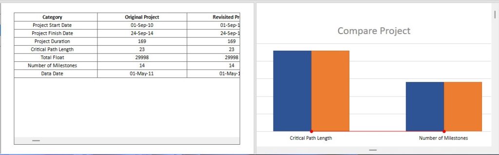
The “Compare Project” tab displays key project metrics and summary statistics between two project versions. This view is organized into two complementary sections:
Comparison Table (Left) – The table provides a structured comparison of essential project attributes across three columns: Original Project, Revisited Project, and Variance. Each row displays a specific project metric:
- Project Start Date: The scheduled beginning date for both versions
- Project Finish Date: The planned completion date for both versions
- Project Duration: Total project length measured in days
- Critical Path Length: The duration of the longest sequence of dependent tasks
- Total Float: The total amount of schedule flexibility (slack time) available
- Number of Milestones: Count of key project milestones
- Data Date: The reference date for the project data snapshot
- The Variance column shows the numerical difference between versions, with “0” indicating no change has occurred for that particular metric.
Visual Chart (Right) – The bar chart titled “Compare Project” provides a graphical comparison of selected numeric metrics:
- Side-by-side bars display values for each metric, with blue bars representing the Original Project and orange bars representing the Revisited Project
- The chart focuses on key metrics such as Critical Path Length and Number of Milestones
- A red variance line can track differences when values change between versions
- The Y-axis scale adjusts automatically to accommodate the metric values being displayed
This dual-view format allows you to quickly assess whether fundamental project parameters have changed between versions, helping you understand the scope and scale of project revisions at a high level before diving into detailed schedule or budget comparisons.
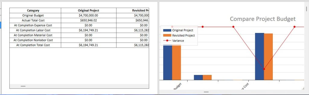
Compare Project Budget
The “Compare Project Budget” tab displays a complete side-by-side analysis of budget data between two project versions. This view is divided into two sections that work together to help you understand financial changes:
Comparison Table (Left) – The table presents a detailed breakdown of budget categories across three columns: “Original Project”, “Revisited Project”, and “Variance”. Each row represents a specific cost category, allowing you to examine:
- Original Budget and Actual Total Cost
- “At Completion” costs broken down by type (Expense, Labor, Material, Nonlabor)
- “At Completion Total Cost” summary
- Variance amounts showing the financial difference between versions (negative values indicate cost reductions, positive values indicate cost increases)
Visual Chart (Right) – The interactive chart provides a graphical representation of the budget comparison, featuring:
- “Side-by-side bar pairs” for each cost category, with blue bars representing the Original Project and orange bars representing the Revisited Project
- An “Orange variance trend line” that tracks the financial differences across categories, making it easy to spot where the largest changes have occurred
- Dual Y-axes: the left axis shows absolute cost values in dollars, while the right axis displays variance amounts
- Category labels along the X-axis for easy reference
This combined view enables you to quickly identify budget changes, understand cost trends, and assess the financial impact of project revisions at both detailed and high-level perspectives.