
Risks view
The Risk module in ScheduleReader provides a focused view of risks that have been exported from Primavera P6. Users can only view risks specifically assigned to the process activities, including key attributes such as risk name, impact, probability, and response strategy.
By offering a clear and accessible overview of relevant risks, the module helps team members stay informed and aligned with project risk management efforts. This ensures accountability and supports timely responses to potential issues. While users cannot create, edit, or delete risks, the read-only access promotes consistency with the source risk data managed in Primavera P6.
Risk tab
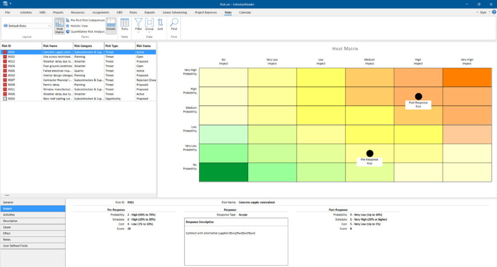
The following functionalities are placed in the Risk tab:

- Layout – Choose how project data is displayed in the currently active view. Each layout shows different columns and applies different groping and sorting of data.
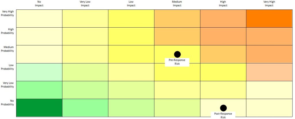
- Heat matrix – Displays a color-coded matrix that visualizes the impact and probability of risks to help prioritize mitigation efforts .
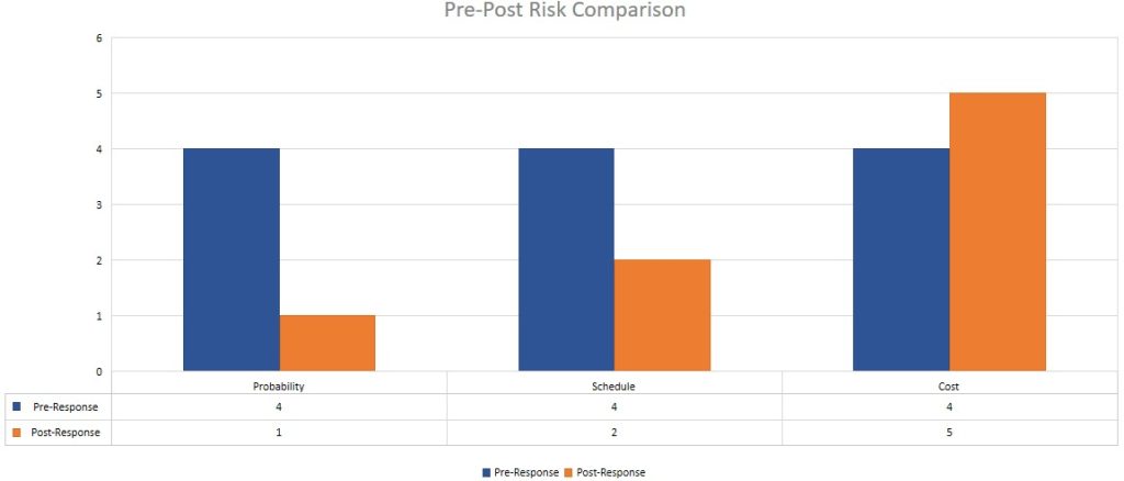
- Pre-Post Risk Comparison – Shows a side-by-side comparison of risk parameters before and after mitigation to evaluate the effectiveness of risk response actions
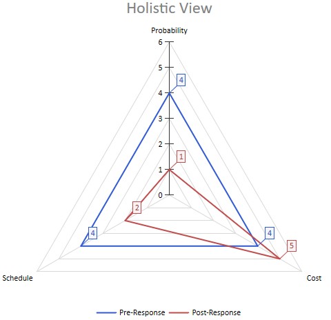
- Holistic View – Provides an integrated overview of the selected risk, its categories, and statuses to support comprehensive risk analysis and decision-making.
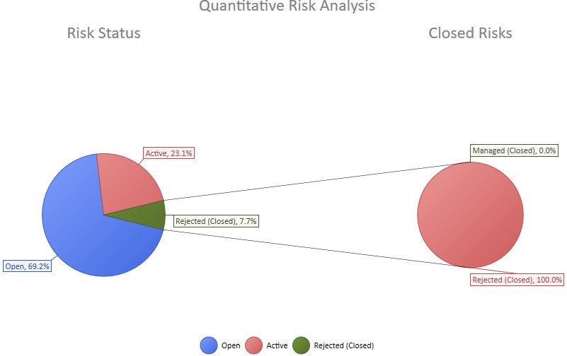
- Quantitative Risk Analysis – Displays the overall risks status in the project plan and the resolution overview of the closed risks.
- Details View – Show on bottom project information details for selected risk or opportunity.
- Risk Table – Add/Remove columns for activity.
- Filter – Filter the risk view based on selected criteria.
- Group – Group the risks in the view by specific criteria
- Sort – Arrange the risks in the table in custom order in ascending or descending sort order.
- Find – Find items in the current Table view.
Risk table
Activity data is given in multiple columns of the activity table. To add or remove columns click on Risk Table button and the Customize columns dialog box will be opened. From the available columns select the desired column and add to the right. To apply the changes simply close the window.
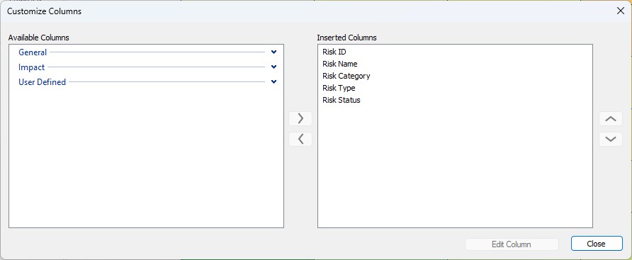
You can change the order of the columns in Risk table, by dragging and dropping a column header to the desired position.
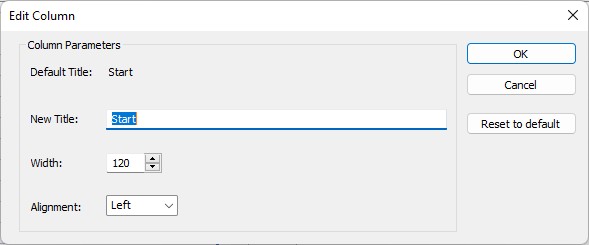
Using the Edit Column functionality, user can rename the existing columns in term of adding title that is different from field’s name and align it according the specific need. The auto-resize functionality, every column will be resized according the longest cell value eliminating the need of manually resizing.
You can copy all table data by pressing the shortcut key Ctrl+C and paste into any other text editor.
Risks details
Enable details to be shown on the bottom of the risk table. Select an risk from table to view detailed information for it as presented in following tabs:
- General – General information for the risk, such as ID, name, category, type, exposure start and exposure finish as well as pre and post exposure cost.
- Impact – View the pre-response, response and post-response information (probability, schedule and cost), as well as the calculated pre- and post-response scores.
- Activities – View on which activities the selected risk is assigned .
- Description – View the documented description of the selected risk .
- Cause – View the recorded causes of the selected risk .
- Effect – View the noted description of the effects of the selected risk .
- Notes – View the documented notes relating to the selected risk .
- User defined fields – View the activity UDF assignments for the selected risk.
Heat matrix
The Heat Matrix in the Risk module visually represents the severity of assigned risks based on their probability and impact. Each risk is plotted on a color-coded grid, making it easy to identify high-priority risks that require attention. The matrix helps users quickly assess the overall risk exposure of their assigned items. It supports better decision-making by highlighting which risks fall into critical, moderate, or low zones. This read-only visualization ensures users remain aligned with the risk data sourced from Primavera P6 while promoting awareness of potential project threats.
Pre-Post Risk Comparison
The Pre and Post Risk Comparison chart in the Risk module visualizes how each assigned risk’s probability, schedule impact, and cost impact change after a response is applied. It provides a side-by-side comparison of risk values before and after mitigation, enabling users to understand the effectiveness of risk responses. This helps team members assess how risk exposure has been reduced through planned actions. The chart supports informed decision-making by clearly displaying improvements or persistent risk levels. Since all data is sourced from Primavera P6, users can trust the accuracy and consistency of the information presented.
Holistic View
The Holistic chart in the Risk module presents a radar-style visualization of each assigned risk’s probability, schedule impact, and cost impact before and after the risk response. This comprehensive view allows users to see all key risk dimensions at once, making it easier to evaluate the overall effectiveness of mitigation strategies. By displaying pre- and post-response values on the same radar graph, users can quickly identify which areas have improved and which may still require attention. The chart enhances understanding of risk dynamics across multiple factors in a single, intuitive format. All data is read-only and aligned with Primavera P6 to maintain consistency and accuracy.
Quantitative Risk Analysis
The Quantitative Risk Analysis chart in the Risk module provides a high-level overview of all risks included in the project plan. It displays the total number of risks, along with how many are currently open, closed, or rejected. This helps users quickly assess the overall status of risk management activities within the project. Additionally, the chart includes a pie chart breakdown of the reasons for rejected risks, offering transparency into why certain risks were dismissed. All information is read-only and directly sourced from Primavera P6, ensuring consistency and accuracy across platforms.